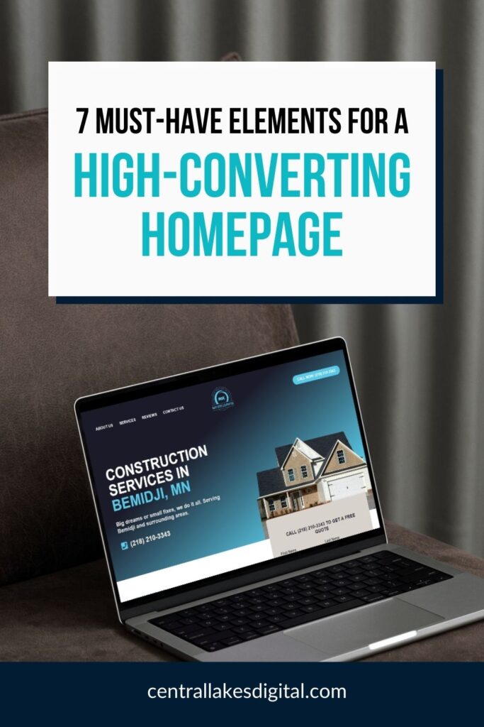
Your homepage is your digital storefront. It’s the first impression potential customers get of your business—and in most cases, you’ve got about 3 seconds to make it count.
We’ve worked with hundreds of small businesses over the years, and we see the same homepage mistakes over and over again. Business owners either try to DIY their site and get overwhelmed, or they hire a big agency that builds something flashy but fails to convert visitors into customers.
Sound familiar? You’re not alone. Let’s fix it.
Here are the 7 essential elements your small business homepage needs—and the common pitfalls to avoid.
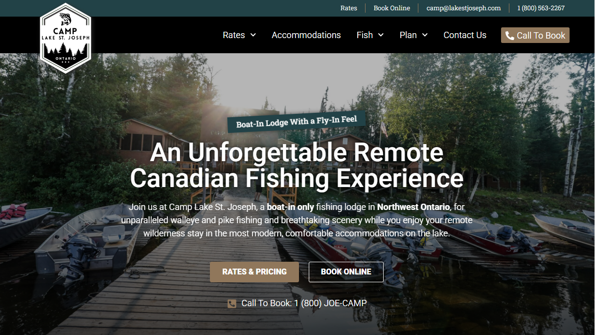
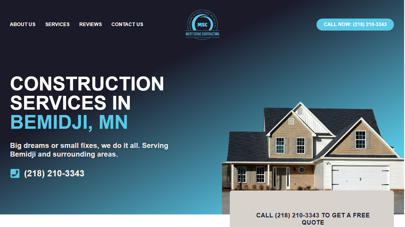
1. A Clear Value Proposition (Above the Fold)
What It Is:
Your value proposition is a simple statement that tells visitors exactly what you do and who you help—in 10 seconds or less. It should appear at the very top of your homepage (“above the fold” means visitors can see it without scrolling).
What Small Businesses Get Wrong:
- Using vague taglines like “Excellence in Everything We Do” or “Your Trusted Partner” that don’t explain what you actually do
- Burying their main message below a large image slider or stock photo
- Assuming people already know what their business does
How to Fix It:
Lead with a clear, benefit-focused headline. For example:
- Instead of: “Welcome to Joe’s Plumbing”
- Try: “Fast, Reliable Plumbing Services for Minneapolis Homeowners”
Make it impossible to misunderstand what you do and who benefits from your services.
2. Mobile-Responsive Design
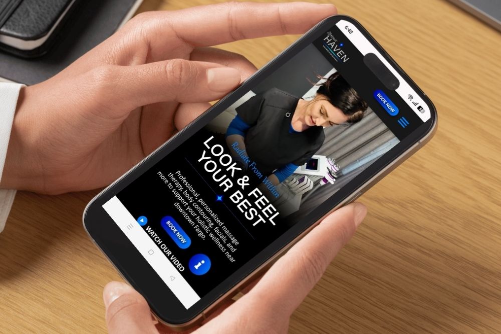
What It Is:
Mobile-responsive design means your website automatically adjusts and looks great on any device—desktop, tablet, or smartphone. More than 60% of web traffic now comes from mobile devices, so if your site doesn’t work well on phones, you’re losing more than half your potential customers.
What Small Businesses Get Wrong:
- Assuming their desktop site “works fine” on mobile when it actually requires pinching and zooming
- Using tiny text and buttons that are impossible to tap on a phone screen
- Never actually testing their website on a real mobile device
How to Fix It:
Work with a designer who builds mobile-first. At Central Lakes Digital, we test every site on multiple devices before launch. Your navigation should simplify on mobile (hamburger menus are your friend), buttons should be large and tappable, and content should stack vertically for easy scrolling.
Pro tip: Pull up your current website on your phone right now. Can you easily click the “Contact Us” button? Can you read the text without zooming? If not, it’s time for an update.
3. Strong, Strategic Calls-to-Action (CTAs)
What It Is:
A call-to-action is the button or link that tells visitors what to do next. Whether it’s “Get a Free Quote,” “Book an Appointment,” or “Shop Now,” your CTA guides people toward becoming customers.
What Small Businesses Get Wrong:
- Using generic CTAs like “Learn More” or “Click Here” that don’t inspire action
- Hiding their main CTA at the bottom of the page where no one scrolls
- Having too many competing CTAs that confuse visitors about what action to take
How to Fix It:
Place your primary CTA prominently at the top of your homepage—ideally in the hero section next to your value proposition. Use action-oriented, specific language:
- “Schedule Your Free Consultation”
- “Get Your Custom Quote Today”
- “Start Your Project”
Make the button visually distinct with contrasting colors. And don’t be afraid to repeat your CTA multiple times throughout the page—just keep the message consistent.
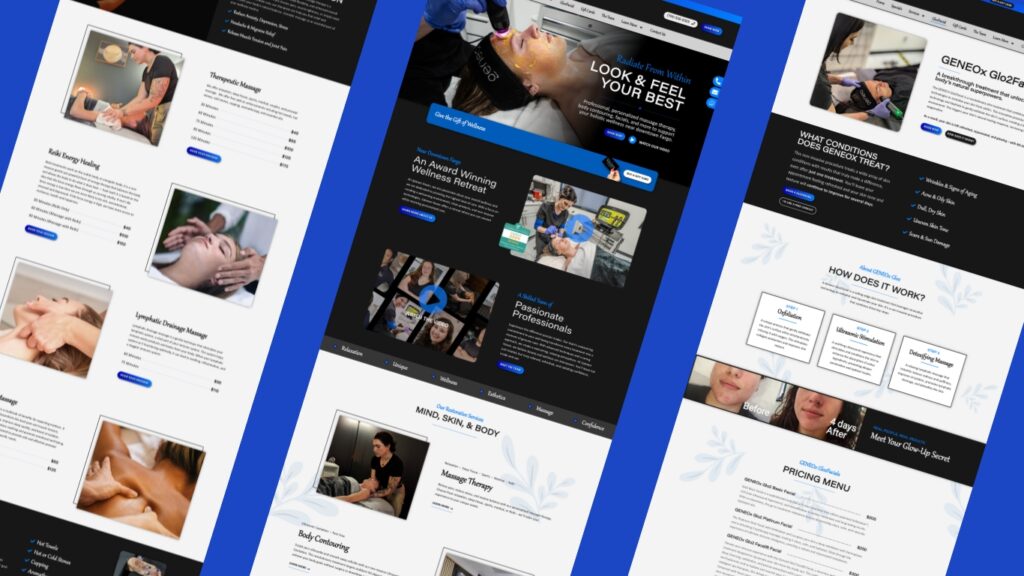
4. Trust Signals That Build Credibility
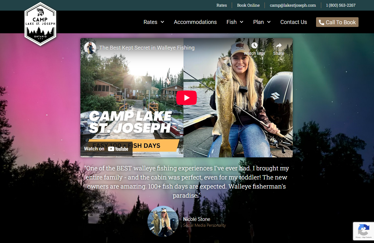
What It Is:
Trust signals are the proof points that show you’re legitimate, reliable, and worth doing business with. This includes customer reviews, testimonials, certifications, years in business, awards, case studies, and recognizable client logos.
What Small Businesses Get Wrong:
- Not including any social proof or testimonials at all
- Using fake stock photos of “customers” instead of real client testimonials
- Forgetting to showcase local credentials or community involvement (especially important for location-based businesses)
How to Fix It:
Add a dedicated testimonials or reviews section to your homepage. Feature real customer names, photos (with permission), and specific results when possible. If you have Google reviews, embed them or link directly to your Google Business profile.
Other trust-building elements:
- Industry certifications or memberships
- “Serving the Bemidji area since 2010” or similar credibility statements
- Security badges for e-commerce sites
- Portfolio or case study highlights
Real testimonials from real people build trust faster than any sales copy you could write.
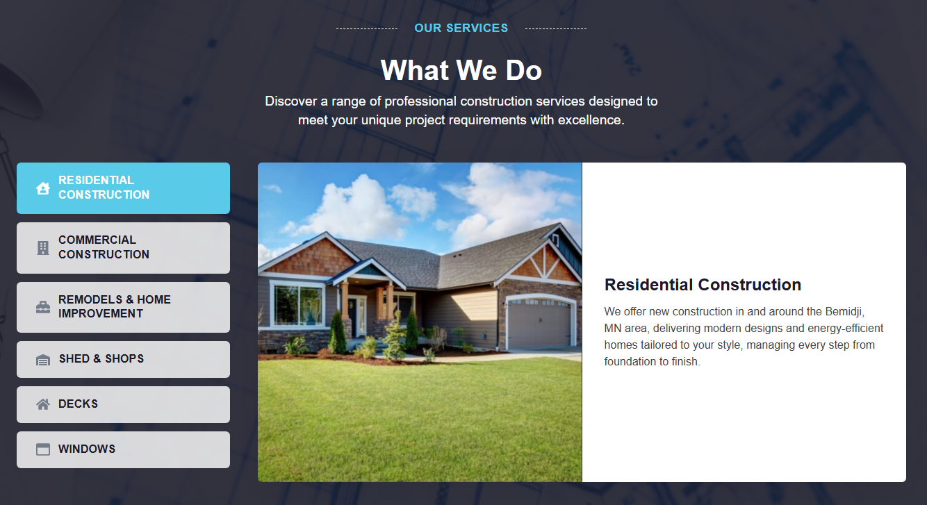
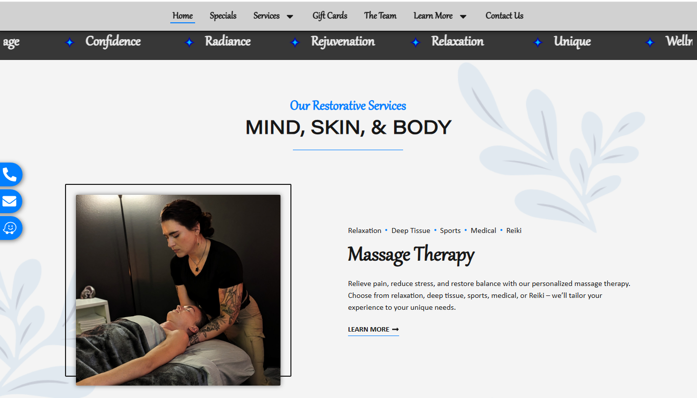
5. A Concise Service Overview (Not an Overwhelming List)
What It Is:
Your homepage should give a clear snapshot of what services you offer—without drowning visitors in details. Think of it as a menu, not a novel. You want to guide people to learn more about the services that interest them.
What Small Businesses Get Wrong:
- Listing every single thing they do in paragraph form, making it impossible to scan
- Organizing services by internal categories that customers don’t understand
- Not linking to dedicated service pages where visitors can dive deeper
How to Fix It:
Create a clean, scannable services section with 3-6 main offerings. Use benefit-focused headlines and one or two sentences of description, then link to dedicated service pages for details.
For example, at Central Lakes Digital, our homepage highlights our core services:
- Website Design & Development
- Digital Marketing
- Branding & Content Creation
Each has a short description and links to a full service page. This keeps the homepage clean while still giving visitors the info they need to explore further.
6. Smart Visual Hierarchy (So People Actually Read Your Page)
What It Is:
Visual hierarchy is the design principle that guides visitors’ eyes through your page in a logical order. It uses size, color, spacing, and contrast to prioritize the most important information and make your homepage easy to scan.
What Small Businesses Get Wrong:
- Making everything the same size, so nothing stands out
- Using walls of text with no headers, bullet points, or white space
- Choosing low-contrast color schemes that are hard to read
How to Fix It:
People don’t read websites—they scan them. Your design should accommodate this:
- Use large, bold headlines for main sections
- Break up text with subheadings, bullet points, and short paragraphs
- Add plenty of white space so the page doesn’t feel cramped
- Use high-contrast colors for text and buttons (dark text on light backgrounds, or vice versa)
Think of your homepage like a roadmap. Your design should naturally guide visitors from your headline, to your services, to your CTA, without confusion or overwhelm.
7. Fast Load Times (Because Nobody Waits Anymore)
What It Is:
Page load time is how long it takes for your website to fully appear on someone’s screen. Studies show that 53% of mobile users abandon a site if it takes longer than 3 seconds to load. Speed isn’t just a nice-to-have—it directly impacts your bottom line and your SEO rankings.
What Small Businesses Get Wrong:
- Using massive, uncompressed images that slow everything down
- Installing too many plugins or widgets without considering performance
- Choosing cheap hosting that can’t handle traffic spikes
How to Fix It:
- Optimize all images: Compress photos before uploading them. Use modern formats like WebP when possible.
- Choose quality hosting: Don’t go with the cheapest option. Invest in reliable hosting that offers good speed and uptime.
- Minimize unnecessary code: Keep your site clean. Delete unused plugins, themes, and scripts.
- Enable caching: This stores elements of your site so they don’t have to reload every time someone visits.
You can test your site speed for free using tools like Google PageSpeed Insights or GTmetrix. If your score is below 80, it’s time to optimize.
Your Homepage Is Your Hardest-Working Employee

A well-designed homepage doesn’t just look good—it works. It attracts the right visitors, communicates your value clearly, builds trust, and converts browsers into buyers.
If your current homepage is missing any of these 7 elements, don’t panic. Small, strategic improvements can make a huge difference. Start with your value proposition and mobile responsiveness—these two alone will dramatically improve your user experience.
And if you’re feeling overwhelmed? That’s exactly why we’re here.
Let’s Build a Homepage That Actually Works
At Central Lakes Digital, we specialize in creating custom websites for small businesses that don’t just look great—they deliver results. We handle the design, development, and strategy so you can focus on running your business.
We’re not your typical agency. We’re your partners. Your success is our success.
Ready to ditch the digital overwhelm and get a homepage that converts? Let’s talk. Contact us today for a free consultation.