Why Local Businesses Can’t Afford to Ignore Mobile Anymore
Picture this: a potential customer is driving through town, searching for “plumber near me” or “best hair salon in Bemidji” on their smartphone. They find your business, tap on your website, and… wait. And wait. It finally loads, but the text is tiny, they have to pinch and zoom to read anything, and the contact form is impossible to submit. Frustrated, they hit the back button and call your competitor instead.
This scenario plays out thousands of times every day for local businesses with outdated websites. In 2025, having a mobile-responsive website is no longer a luxury or a nice-to-have feature—it’s the baseline expectation for any business that wants to compete effectively. For local businesses, especially, where customers are actively searching on the go and making quick decisions, mobile optimization can make or break your success.
What Mobile-Responsive Design Actually Means

Let’s clear up some confusion. A mobile-responsive website is one that automatically adapts its layout, images, and functionality to fit any screen size—whether that’s a smartphone, tablet, laptop, or desktop computer. The design “responds” to the device being used, ensuring an optimal viewing experience no matter how someone accesses your site.
This is different from having a separate mobile site (those old “m.yoursite.com” versions) or a site that’s simply “mobile-friendly” but doesn’t truly adapt. Responsive design utilizes flexible grids, layouts, and CSS media queries to create a single website that functions seamlessly across all devices.
Think of it like water in a container. Pour water into a tall glass, and it takes that shape. Pour it into a wide bowl, and it adapts to that shape instead. A mobile-responsive website does the same thing—it flows and adjusts to fit whatever “container” (device) it’s being viewed on, maintaining functionality and aesthetics across all platforms.The best mobile-responsive websites today are built using a mobile-first design approach. This means designers and developers consider the mobile version from the ground up and progressively enhance the experience for larger screens. This is the opposite of the old way of doing things, where sites were designed for desktop computers and then awkwardly squeezed down to fit phones. Mobile-first design ensures that the most important content and features are prioritized from the beginning, load times are optimized for cellular connections, and the user experience is seamless regardless of device. It’s not just about making things smaller—it’s about rethinking how people interact with your site on the device they’re most likely to use.
The Numbers Local Businesses Need to Know

The statistics around mobile usage aren’t just interesting—they’re critical for understanding where your customers are and how they’re finding you. More than 60% of all web traffic now comes from mobile devices, and that number continues to climb year after year.
For local businesses, the numbers are even more compelling. Studies show that 76% of people who search for something nearby on their smartphone visit a related business within 24 hours, and 28% of those searches result in a purchase. When someone searches “restaurants near me” or “emergency dentist,” they’re not just browsing—they’re ready to take action right now.
Mobile users also behave differently from desktop users. They’re often multitasking, have less patience for slow-loading pages, and need information quickly and clearly. If your website doesn’t deliver a smooth mobile experience, you’re not just losing a website visitor—you’re losing a customer who was ready to buy.
Why Mobile Responsive Websites Matter for Local SEO
Here’s something many local business owners don’t realize: Google predominantly uses the mobile version of your website for indexing and ranking. This is called “mobile-first indexing,” and it means that if your site doesn’t work well on mobile, your search rankings will suffer—even for people searching on desktop computers.
For local businesses competing for “near me” searches and local pack rankings, this is especially critical. Google wants to send its users to websites that provide a great experience, and mobile performance is a huge part of that equation. A slow, non-responsive website signals to Google that your site provides a poor user experience, which can push you down in search results.
Mobile responsiveness also connects directly to your Google Business Profile. When potential customers find you in local search results and click through to your website, Google tracks what happens next. If visitors immediately bounce back because your site doesn’t work on their phone, that sends a negative signal that can impact your local SEO performance over time.
The Real Cost of a Non-Responsive Website

Let’s talk about what a non-responsive website is actually costing your business. First, there’s the direct loss of customers. Every person who lands on your site from their phone and can’t easily navigate it, read your content, or find your contact information is a potential customer walking straight to a competitor.
Then there’s the bounce rate problem. When visitors leave your site within seconds because it doesn’t work properly on their device, it tells Google your site isn’t valuable or relevant. This creates a vicious cycle—poor mobile experience leads to high bounce rates, which leads to lower search rankings, which means fewer people find you in the first place.
Finally, there’s your competitive disadvantage. While you’re losing customers to a clunky mobile experience, your competitors with modern, responsive websites are capturing those leads. In many local markets, having a better website than your competition can be the deciding factor in who gets the call, the appointment, or the sale.
The worst part? You might not even realize it’s happening. Unlike a broken door or a rude employee that you’d notice immediately, a poor mobile website quietly drives away potential customers 24 hours a day, 7 days a week, without you ever knowing how much business you’re missing.
Key Elements of a Good Mobile Responsive Website

So what does a truly effective mobile-responsive website look like? It starts with speed. Mobile users are often on cellular connections, and they won’t wait around for a slow site to load. Your site should load in under three seconds—anything longer and you’ll start losing visitors rapidly.
Navigation needs to be simple and touch-friendly. Large, easily clickable buttons replace hover-based menus. Important information should be front and center, not buried three clicks deep. Your phone number should be a clickable “call now” button, not text that someone has to copy and paste.
Text must be readable without zooming or scrolling horizontally. Images should scale appropriately without breaking the layout. Forms need to be simple and easy to fill out on a small screen—think fewer fields, larger input boxes, and mobile-optimized keyboards that pop up automatically.
Contact features are especially important for local businesses. Click-to-call functionality, easy-to-find addresses with map integration, and simple contact forms can be the difference between someone reaching out or moving on to the next option. Your mobile-responsive website should make it ridiculously easy for customers to take action.
How to Tell If Your Website Is Truly Mobile-Responsive

Want to know if your current website passes the mobile test? Start by pulling out your smartphone and visiting your own site. Can you read everything easily? Are the buttons big enough to tap without frustration? Does the page load quickly? Try filling out your contact form or finding your phone number—is it easy or annoying?
You can use tools like Chrome Lighthouse or PageSpeed Insights to evaluate your site’s mobile responsiveness, performance, and accessibility. These tools provide detailed reports showing what’s working well and what needs improvement. You can also check your Google Search Console for any mobile usability issues that Google has detected.
Pay attention to real user behavior too. If you’re getting plenty of mobile traffic in your analytics but very few conversions or contact form submissions from mobile visitors, that’s a red flag that something isn’t working properly on smaller screens.
Partner with a Mobile-First Web Designer

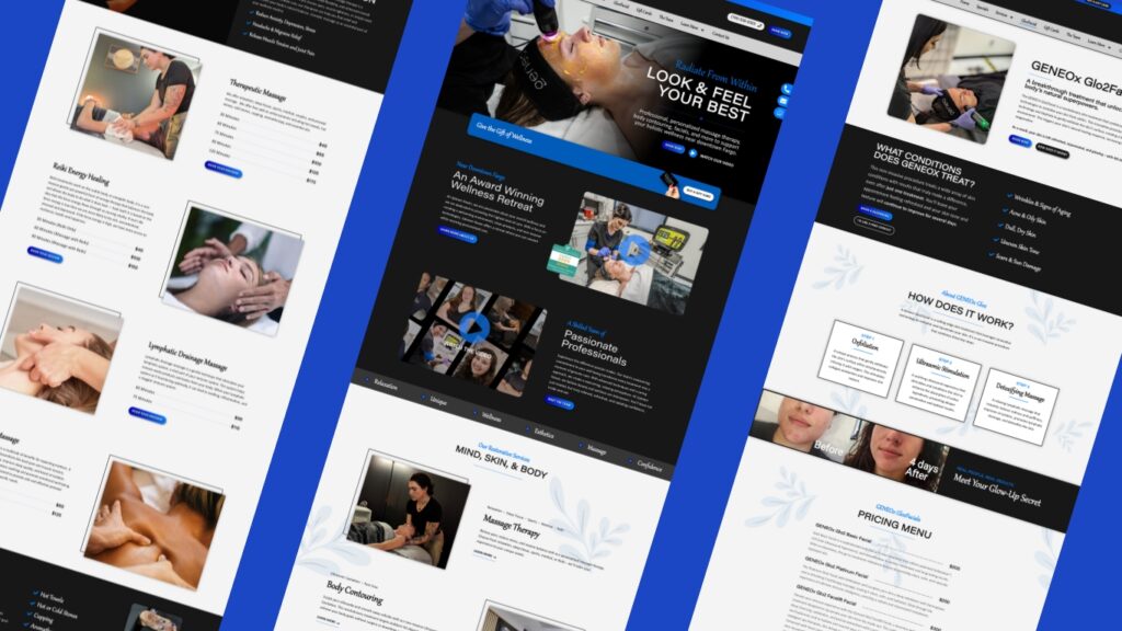
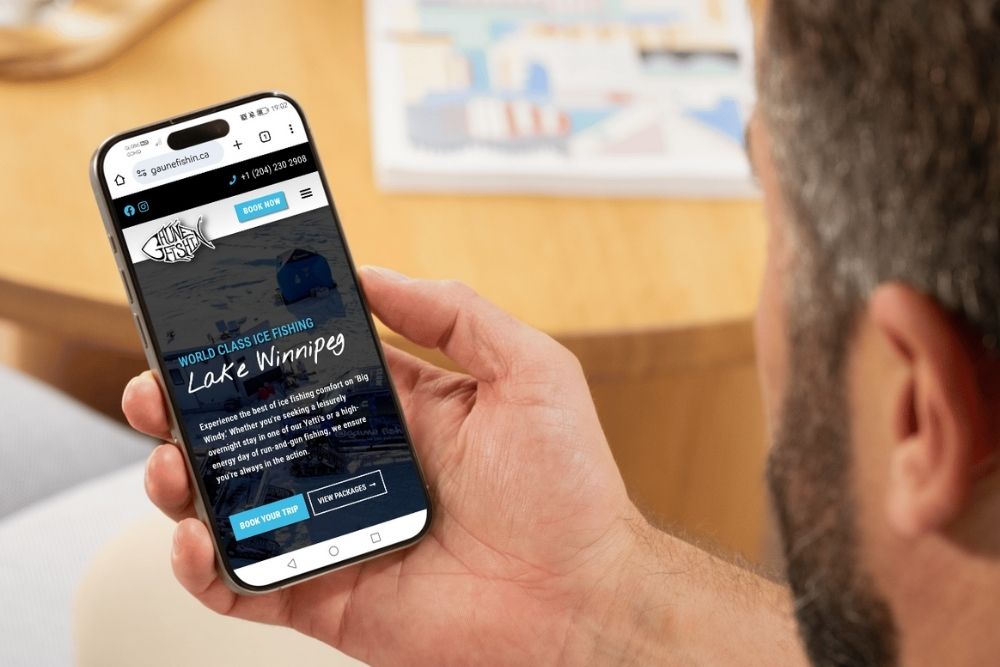
The good news is that if your website isn’t mobile-responsive yet, fixing it is entirely within reach. Modern website redesigns put mobile responsiveness at the core of the development process, ensuring your site works beautifully on every device from day one.
At Central Lakes Digital, we use a mobile-first design approach for every website we build. This means we start with your mobile experience and build up from there, ensuring that the majority of your visitors—those searching on their phones—get the absolute best experience possible. With the right set of tools, we create mobile-responsive websites that are not only beautiful but also fast, functional, and built to convert visitors into customers.
For local businesses, investing in a mobile-responsive website isn’t just about keeping up with technology—it’s about meeting your customers where they already are. When someone searches for your services on their phone, your website should make it easy for them to choose you.
Ready to stop losing customers to a poor mobile experience? A mobile-responsive website is one of the smartest investments you can make in your business’s growth. It works for you 24/7, turning mobile visitors into customers and ensuring you’re never invisible to the people actively searching for what you offer. Let’s talk about building a mobile-first website that works as hard as you do.